In past blog articles, we've underscored the role of branching scenarios in creating interactive, engaging, and effective content.
It comes up so often, in fact, we thought it was time to highlight an eLearning example we built using a feature we released last fall, our Scenario Builder. It's a user-friendly widget that helps anyone build complex branching conversations – no programming necessary.
Onboarding for New Employees: a Scenario-Based eLearning Example
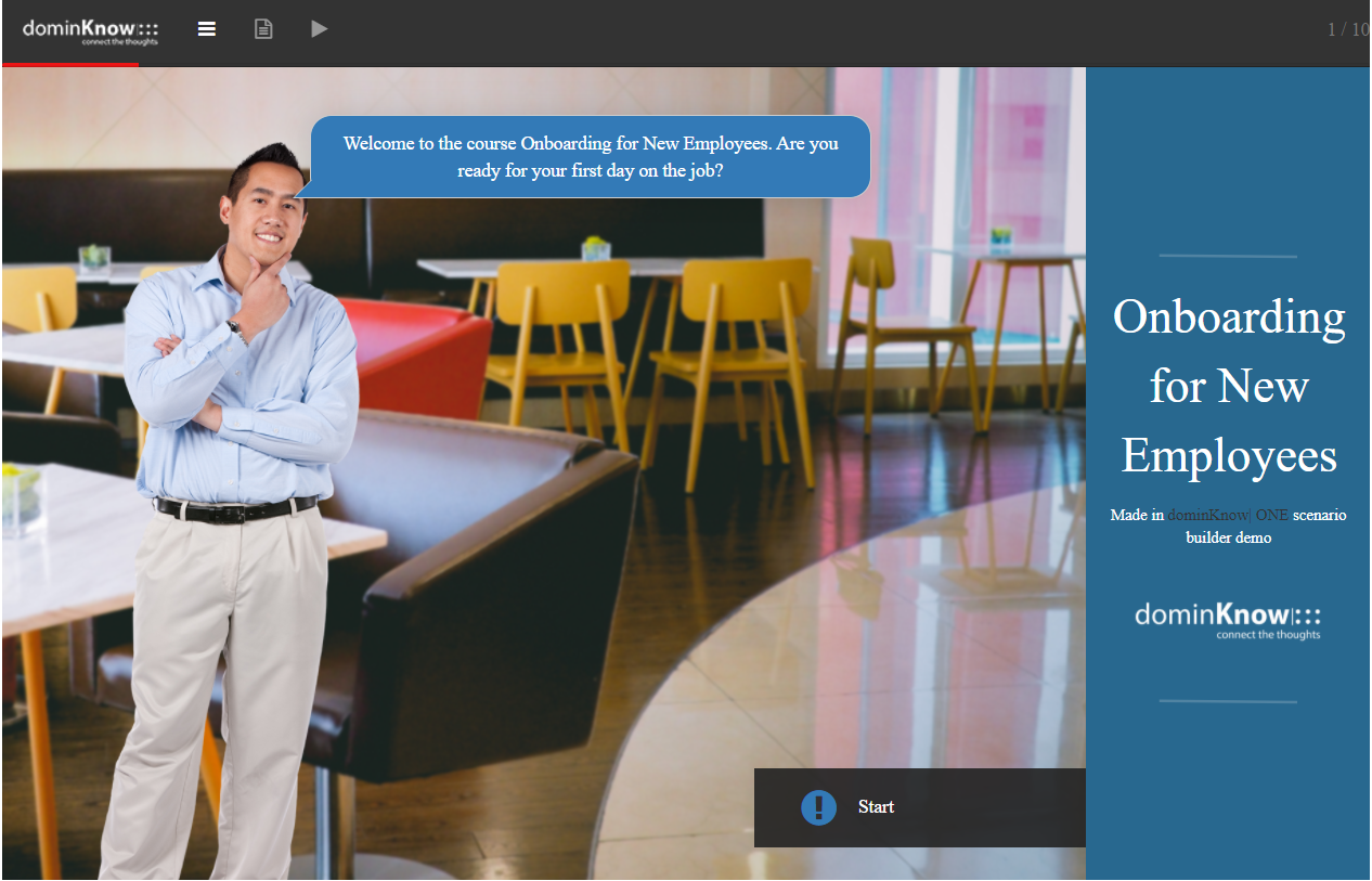
The Onboarding for New Employees sample is a simple use of Scenario Builder, but it shows off the essentials and does a great job of illustrating how Scenario Builder can liven up an otherwise dull topic.
This course could have been a flat, simple recitation of company policy for new hires. Instead, it seeks to replicate that first-day-on-the-job experience by mixing short branching conversations with "real" company assets (like maps).
Let's look at the techniques this eLearning example uses to create a more immersive and personalized experience.
Choosing the Right Characters for Your Audience
One of the ways to supercharge the immersive value of a branching scenario is to create a sense of time and place, involving your learner's senses as much as possible and sprinkling realism where you can.
If you're creating a "realistic" conversation, the person you're talking to is an important piece of the puzzle.
In Scenario Builder, you can draw from dozens of options in our stock people collection. You can select the type of attire (like business, casual, or medical) or add some whimsy by opting for cartoons instead of real models.
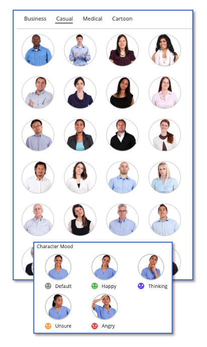
For each of these characters, the Scenario Builder lets you choose a "mood" for each step of the scenario.
Creating a Sense of Place
As you move through this eLearning example, you'll notice that conversations take place in different parts of "campus."
Your first day starts out, as most do, in the employee common area with someone from HR.
Later, you take a tour of the kitchen.
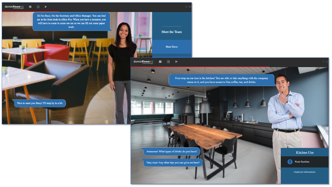
At one point, you even step outside to "look" at parking and bike storage.
The Scenario Builder only allows one conversational partner and one background per scenario, but you can introduce different settings or people by using multiple scenarios within the same project.
That's what we did with this Onboarding example. Every time you see the "play" button, you're entering a new branching scenario.
There are a wide variety of backgrounds to choose from in order to create the right experience.
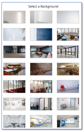
Since Scenario Builder draws from a generally available pool of stock art, you can use the same character and background images throughout the project, not just the parts built in the scenario widget. The visual continuity can help maintain your narrative more seamlessly.
And new! Custom People and Places
While the first version of Scenario Builder uses stock images to give authors a broad but practical set of options, we know they don't meet everyone's needs.
That's why the next step is custom people and places in Scenario Builder. You'll be able to customize your scenarios from your own image library, just as you can use custom assets in other parts of dominKnow.
This isn't just for covering gaps in the necessary settings or attire. It opens up the possibility of bringing more realism – and therefore, immersion – to your branching scenarios.
Imagine if the Onboarding eLearning example featured photographs of your company's real common spaces, and when the CEO introduced themselves, it was your company's actual executive.
The course would feel like an orientation exercise and more like an actual introduction to your workplace.
Providing Choices to Personalize the Course
Choices and interactive elements are often cited as important tools for keeping learners awake and engaged.
While branching scenarios shine the brightest when used for problem-solving and process reinforcement, thiseLearning example leverages the Scenario Builder to increase engagement and personalize the onboarding.
In a flat version of this onboarding course, new employees would be presented with general policy, including pieces of information that don't apply to them. Naturally, it's important for employees to have access to full policies, but relevance is the key to attention (and therefore, retention).
When most of the information is irrelevant, learners will skim, which increases the likelihood of missing the parts that are relevant.
In this eLearning example, we use the branching option to highlight the information each user needs most. This technique pops up first in the transportation policy section.
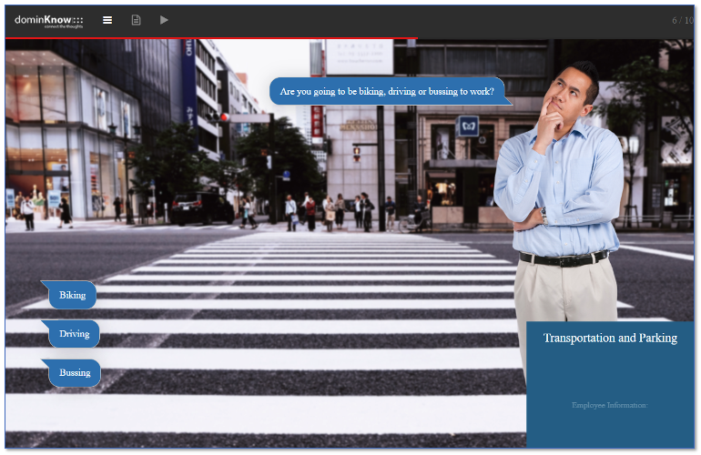
No matter what transportation option you choose, you'll receive a parking lot map. However, your choice between biking, driving, or bussing determines whether you learn how to check out a bike lock, discover where to request a parking permit, or hear about the company's bus pass program.
Similarly, when your guide relays dress code policy, you have to tell them what department you're in. Dress code policy is different for salespeople, who interface with the public, than it is for employees with less visible roles.
By asking the learner to specify their department, you remove some of the chance for confusion and mistakes.
Giving Voice to Your Scenario
Here's a trick you won't find in the Onboarding sample, though you can find it in other scenario-based eLearning examples from our library: you can add audio clips to increase immersion.
Speech bubbles are a must in Scenario Builder, but audio files can be added for each text item.
You can use that to turn your written dialogue into a real "conversation."
Making Scenarios Responsive or Fixed Pixel
This Onboarding eLearning sample was authored in Claro, the fixed-pixel option within dominKnow | ONE.
Fixed pixel is exactly what it sounds like – the content doesn't rearrange itself to fit the screen. If you try to shrink the browser down to mobile dimensions, you'll notice that the Onboarding sample maintains its screen display ratio.
Obviously, that's not a concern in cases where you know most users will view the course on a larger screen. We've talked in the past about the ways fixed-pixel authoring can open up a world of creative possibilities, so for those projects, Claro might be preferable.
However, you can also use the Scenario Builder in projects authored in Flow. That's Claro's sister tool with built-in responsive functionality.
Scenarios built in Flow are the better choice when you know the content will be accessed on smartphones.
For scenarios authored in Flow, the character avatar shrinks to an icon on mobile to free up screen space for the text.
No matter what transportation option you choose, you'll receive a parking lot map. However, your choice between biking, driving, or bussing determines whether you learn how to check out a bike lock, discover where to request a parking permit, or hear about the company's bus pass program.
Similarly, when your guide relays dress code policy, you have to tell them what department you're in. Dress code policy is different for salespeople, who interface with the public, than it is for employees with less visible roles.
By asking the learner to specify their department, you remove some of the chance for confusion and mistakes.
Simple or Complex Scenarios, No Programming Necessary
Now that you have some context for what Scenario Builder can do, let's look at how the widget saves you from programming.
Before we added Scenario Builder, building a branching scenario involved many complicated steps. It was better suited to technically intermediate or advanced users.
Now it's doable for novices, too. Scenario Builder opens up the ability to map out complex scenarios with dozens of pathways to anyone and everyone.
Just insert the Scenario Builder widget onto a page and follow the prompts.
First, you'll choose style settings like your background image, your digital conversation partner, and the look of your text bubbles. You can also write an introduction to explain the scenario if you wish.
Then the rubber meets the road.
Conversational branching scenarios rely on a fictional guide to prompt learners into making choices. For each choice a learner makes, there will be an editing screen like the one below – one text field for the guide to provide information and ask questions, plus one text field for each choice the user has.
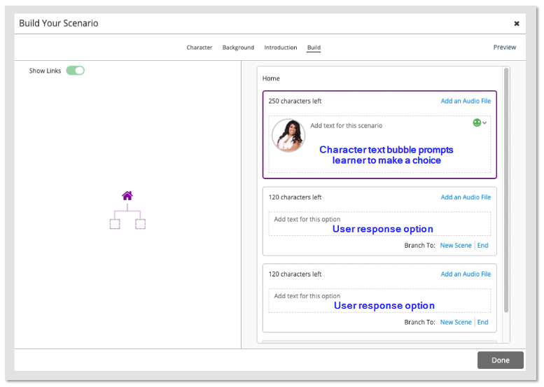
You start with two learner choices by default, but you can add as many as you need by scrolling to the bottom of the screen and clicking "Add a Choice." You can see this option in the screenshot below.
Scenario Builder has a schematic on the left that helps you visualize your location. You can also navigate to a different step by clicking on the appropriate box within the map.
You'll see the previous step's user response at the very top of the right-hand column. This is the equivalent of a "You Are Here" sticker on a map. On the first screen, it simply says "Home," but in later branches, you'll see the text bubble that leads to the step you're editing.
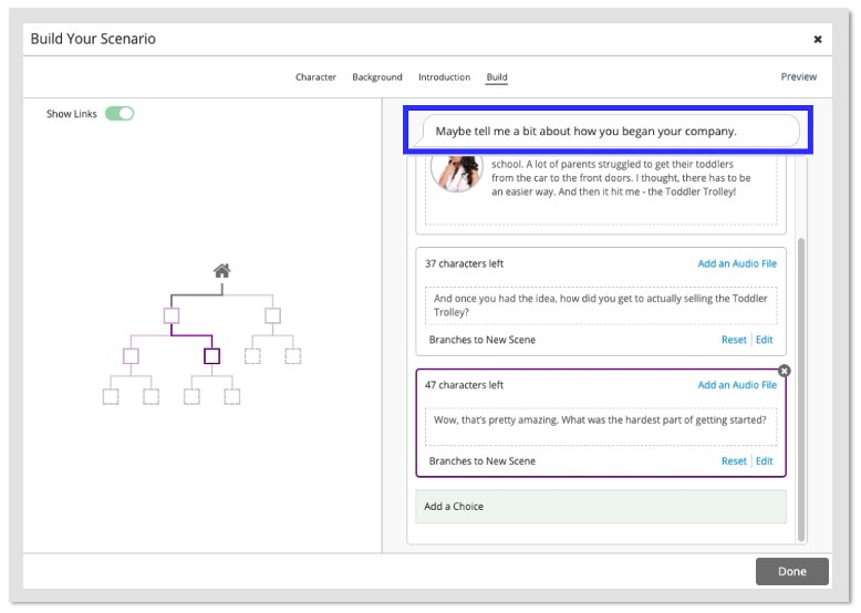
For each user response you create in the scenario, you have to decide whether selecting that option leads to a new scene (a new set of choices) or whether it's an "end" point.
The editing screen for "new scenes" all look the same, but an end screen has additional settings.
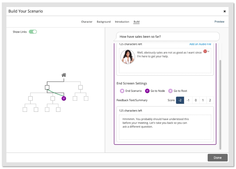
On an end screen, you can input the avatar's response to your last user choice, then you have some decisions to make.
An endpoint in a branching scenario doesn't have to mean game over – in fact, there's more to be learned by backtracking. Endpoints can send learners to one of three locations: out of the scenario (i.e., game over), back to the previous node (i.e., the last choice they made), or back to the root (i.e., square one).
If you choose to send them backward, a green line will appear in your scenario schematic to show this path. You can toggle these green "links" to invisible if your schematic becomes too cluttered.
Finally, you have to choose feedback and a score for each endpoint. You'll give the user feedback on why their choice was right or wrong, as well as a numeric score.
Using Scenario Scores and Variables
Obviously, the main purpose of assigning a numeric score to any endpoint choice is to determine proficiency.
In complex branching scenarios, the score will continue to accumulate as you hit dead ends and backtrack. You'll gain points for "good" decisions, lose or miss out on points for "bad" decisions, and finish with a grand total.
This is the most common use of scores. However, the Onboarding eLearning example illustrates another use.
None of the decisions you make in the Onboarding sample have a value judgment attached. Nevertheless, we apply a score. Why? As a trigger to allow you to move on.
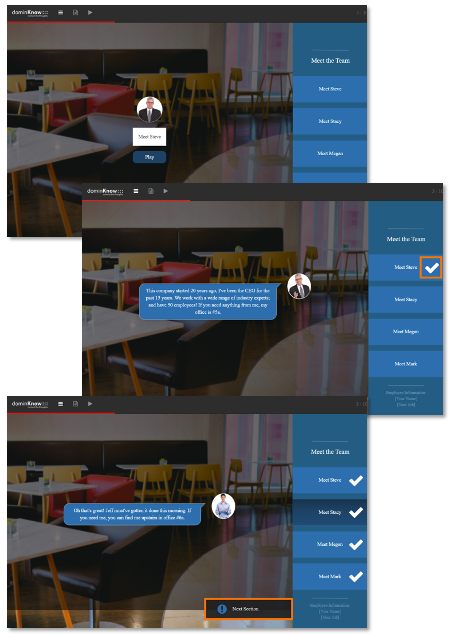
Let's take this set of scenarios:
That page is composed of four layers of branching scenarios, one for each "teammate." As you click on a name to the right, it reveals the appropriate layer/scenario. Once you finish each conversation, the score for that scenario triggers the unhiding of a checkmark next to that name.
Once all four scenarios have a score, regardless of order, the button for the next course section is revealed.
These triggers, and similar triggers throughout the course, prevent learners from skipping any steps.
Bottom Line
Branching scenarios can help learners practice solving complex problems or "carrying out" intricate processes. And even simple versions of a branching scenario can be used to induce immersion, customize learning, and reinforce attention to every part of the course.
Either way, our Scenario Builder feature removes technical barriers so your learners can benefit from this technique regardless of your team's skill set. It's just one of the ways we try to improve your eLearning authoring experience with us.
Interested in learning more? Contact us today to request a demo from our experts – or, just pass Go and sign up for our free 14-day trial.


